After our collaboration on Homegirl, founder
Erin Dana Lichy invited us to create the identity for her next venture:
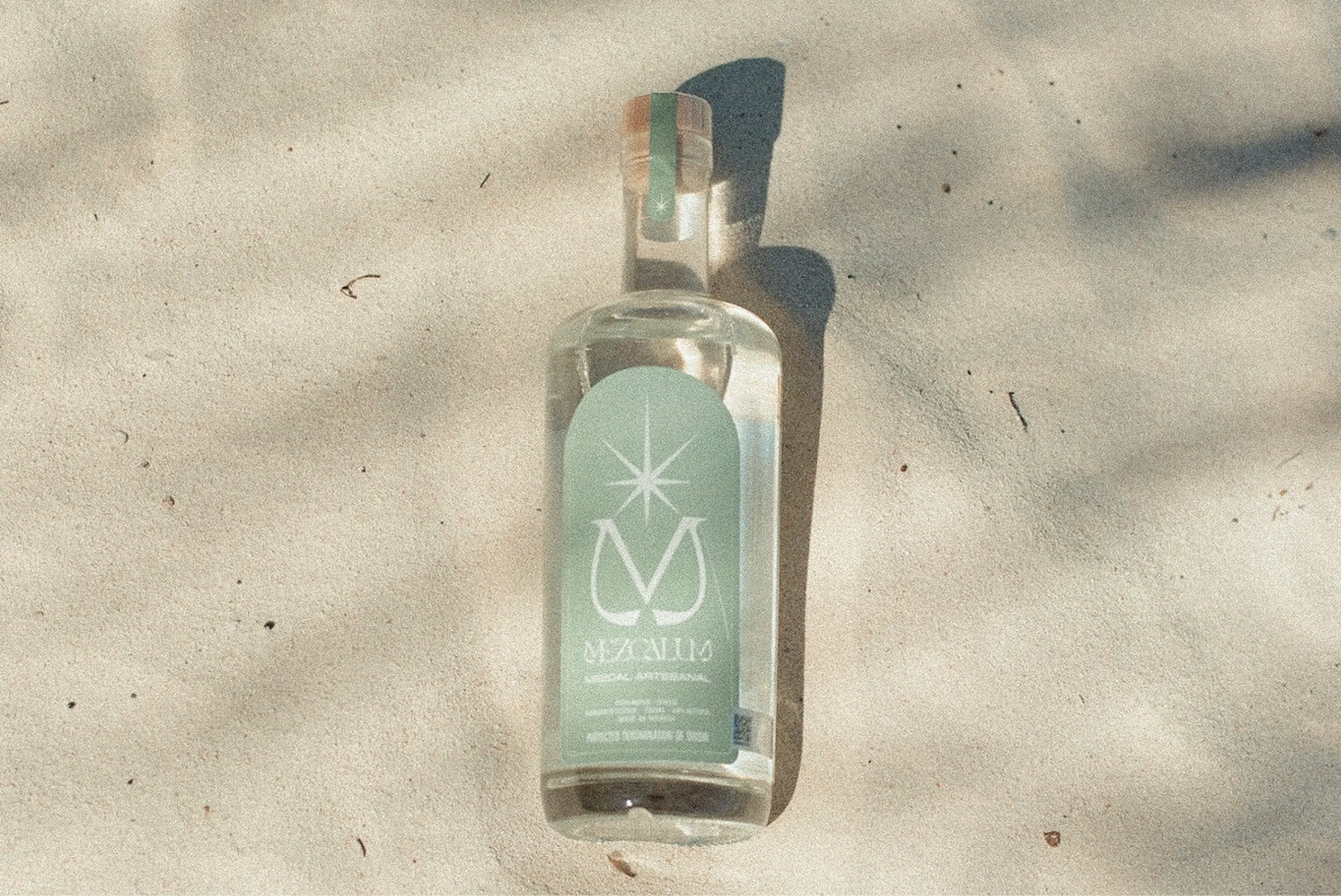
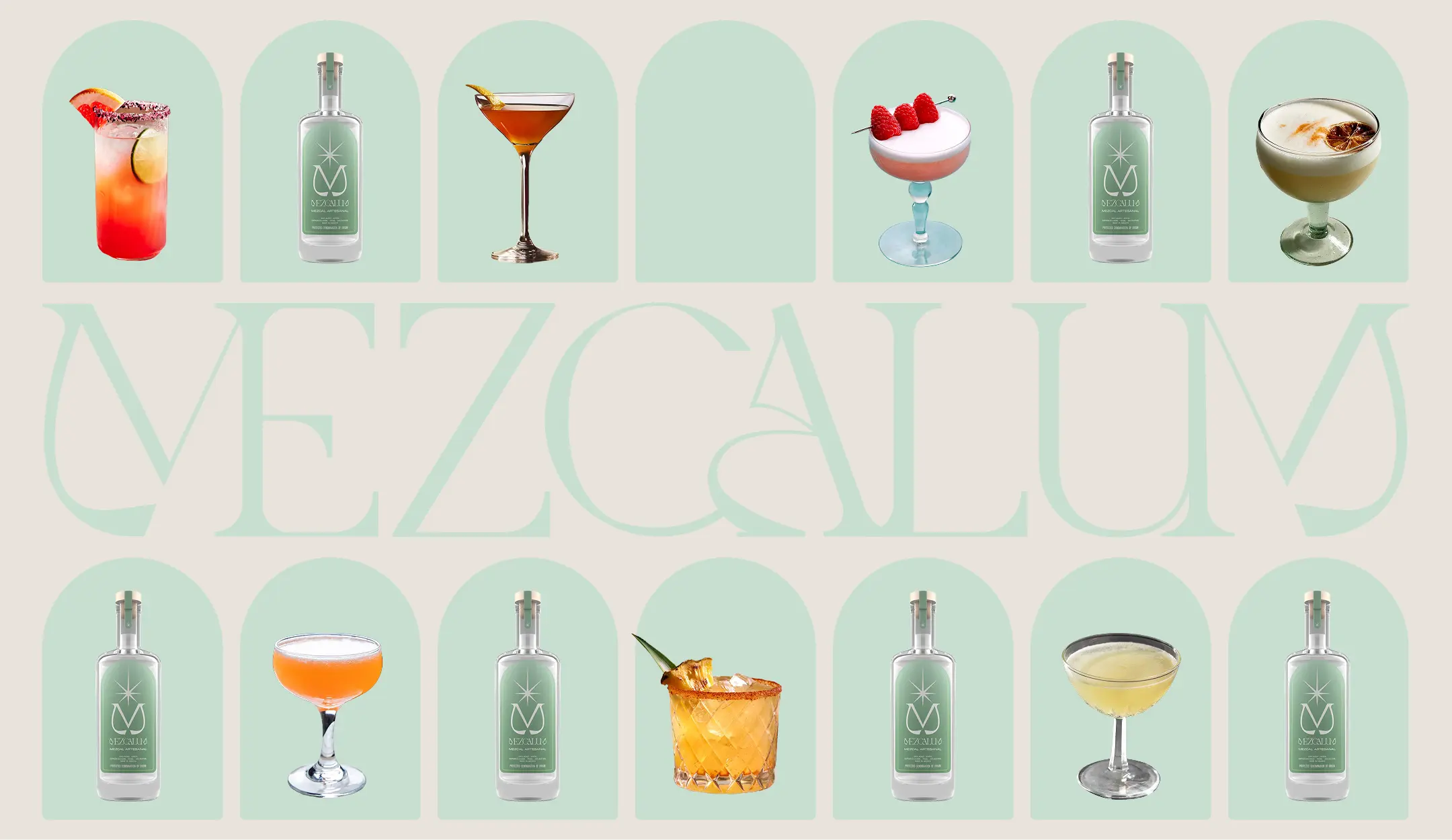
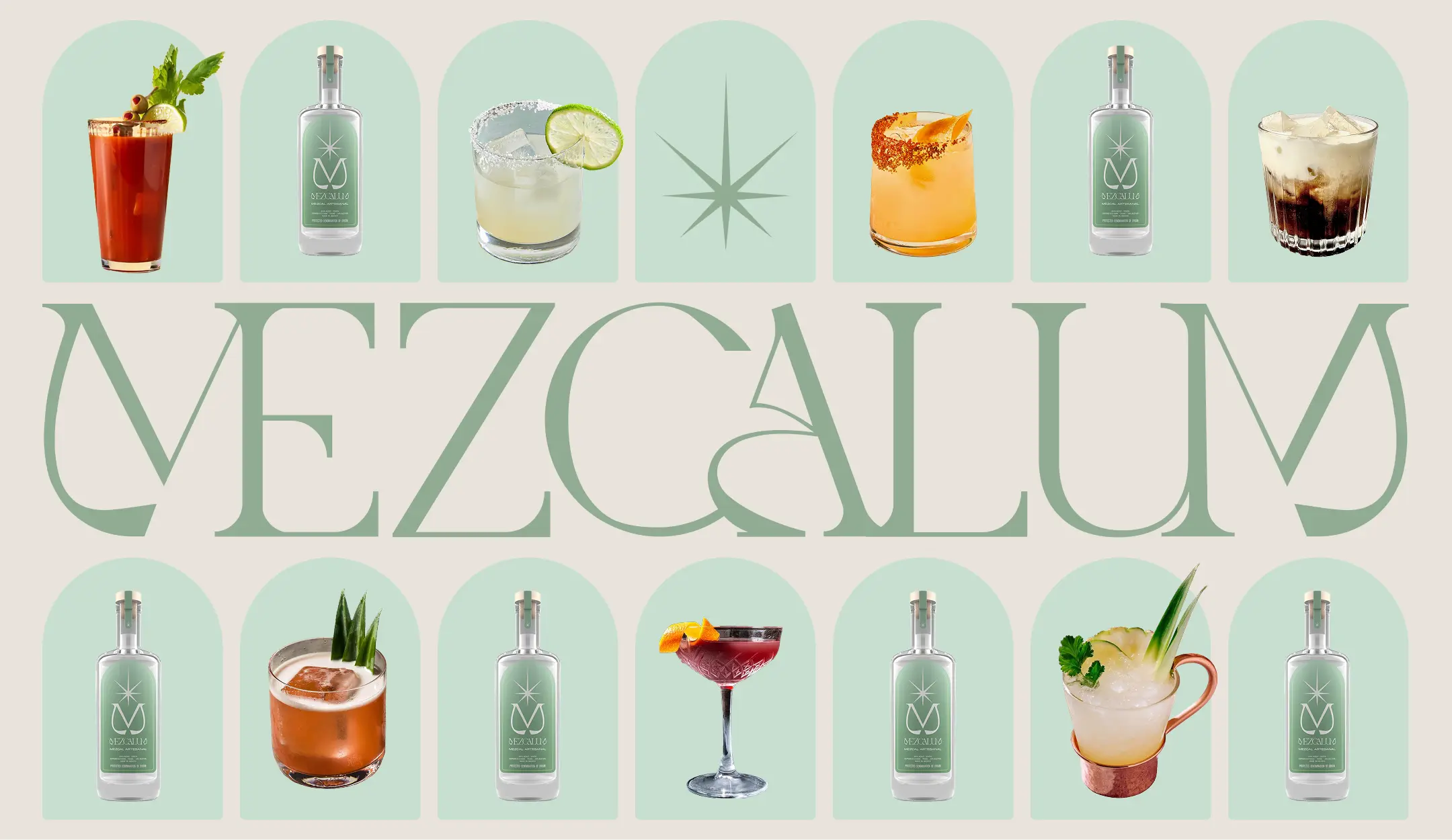
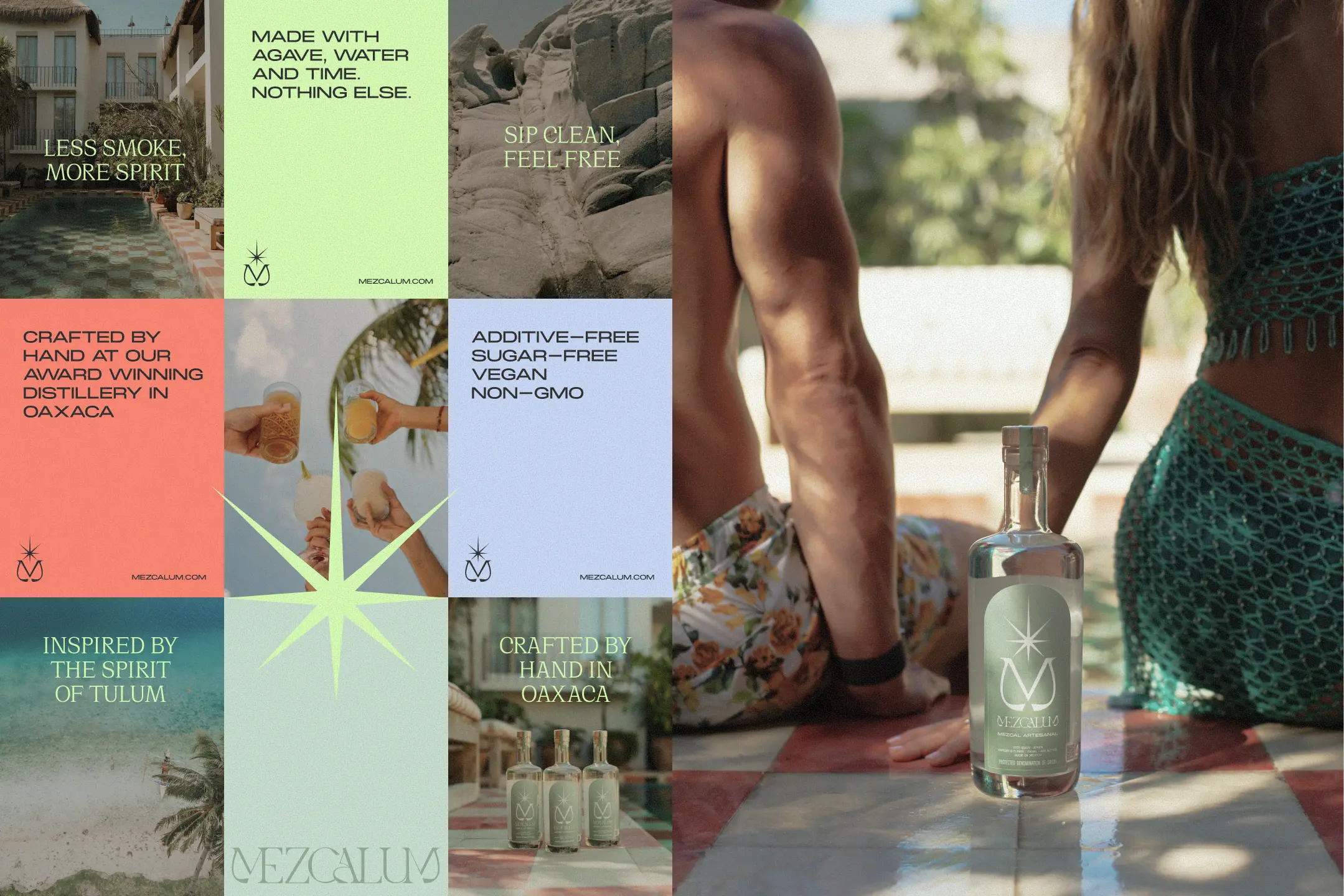
Mezcalum—an all-natural, artisanal mezcal handcrafted in Oaxaca and inspired by the effortless spirit of Tulum.
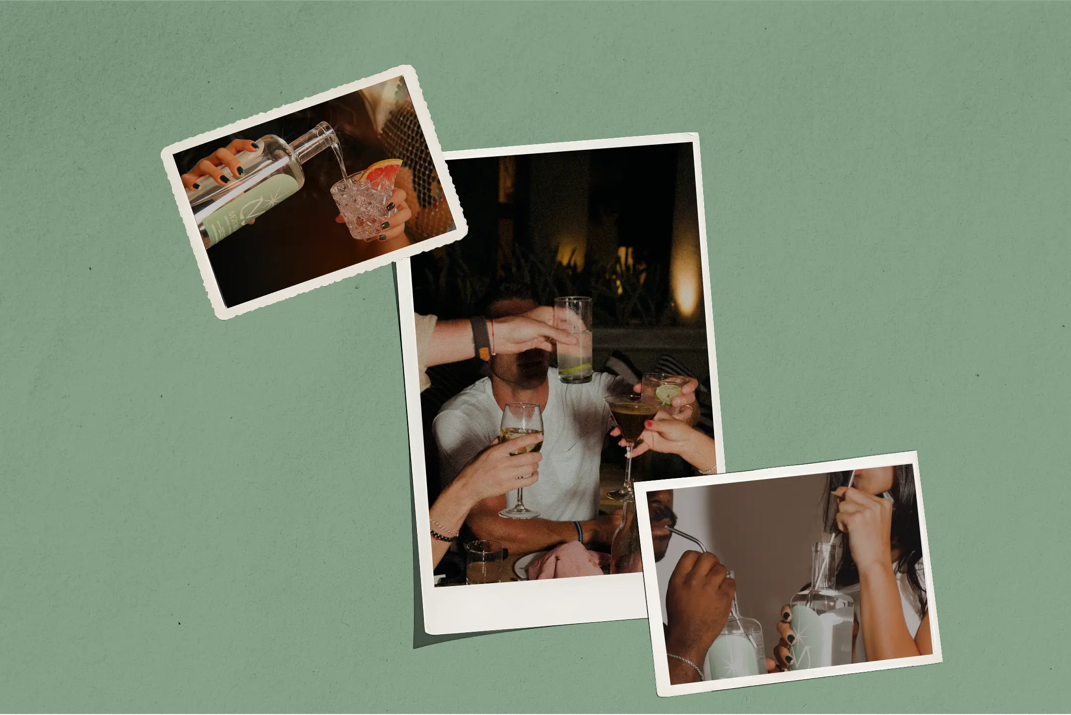
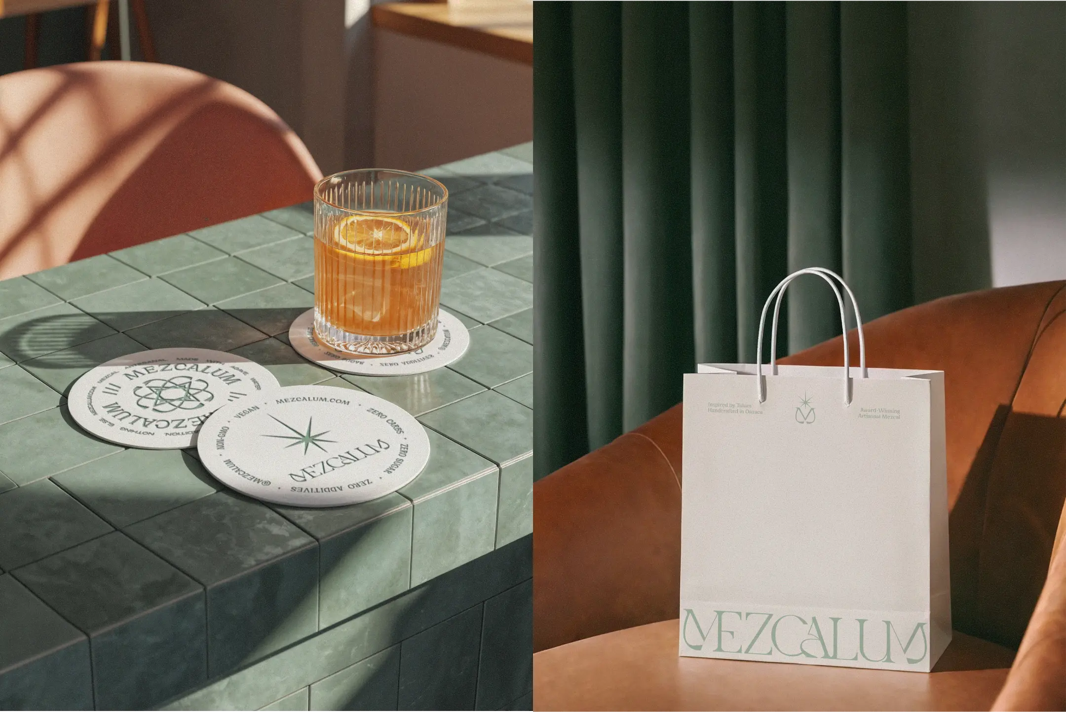
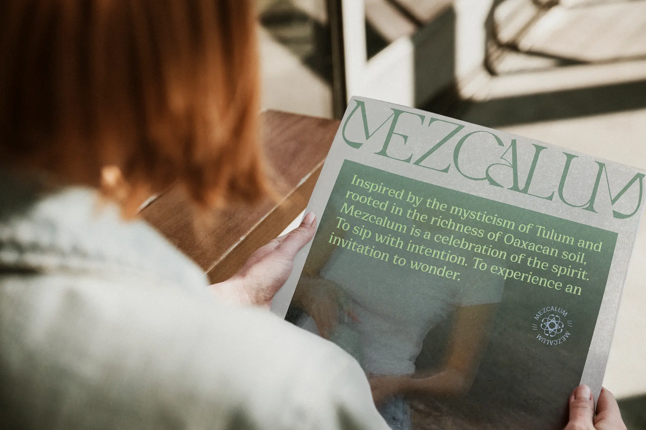
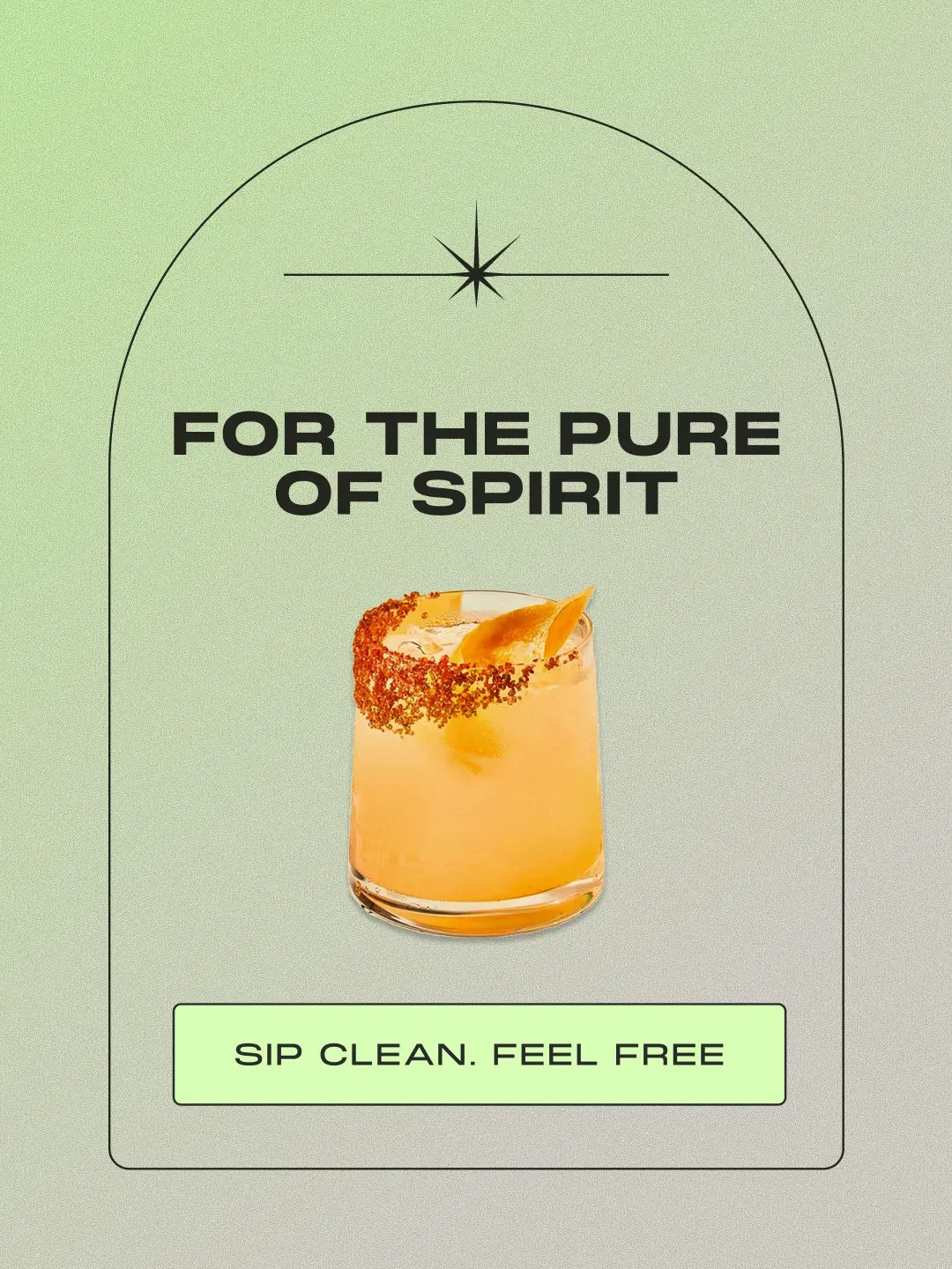
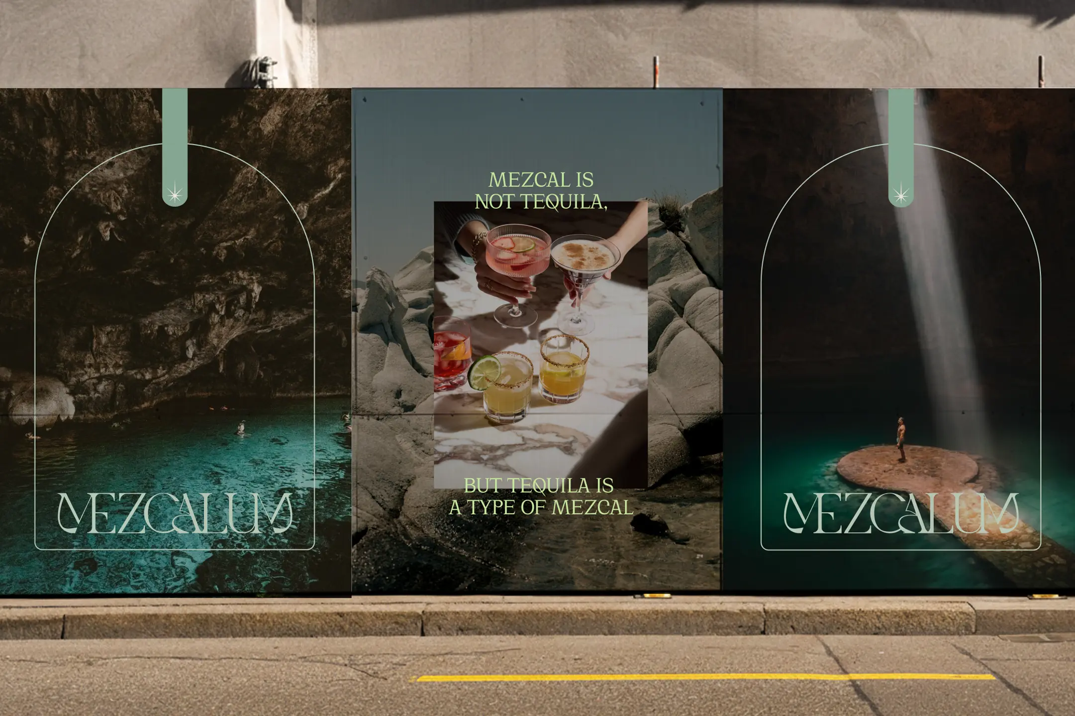
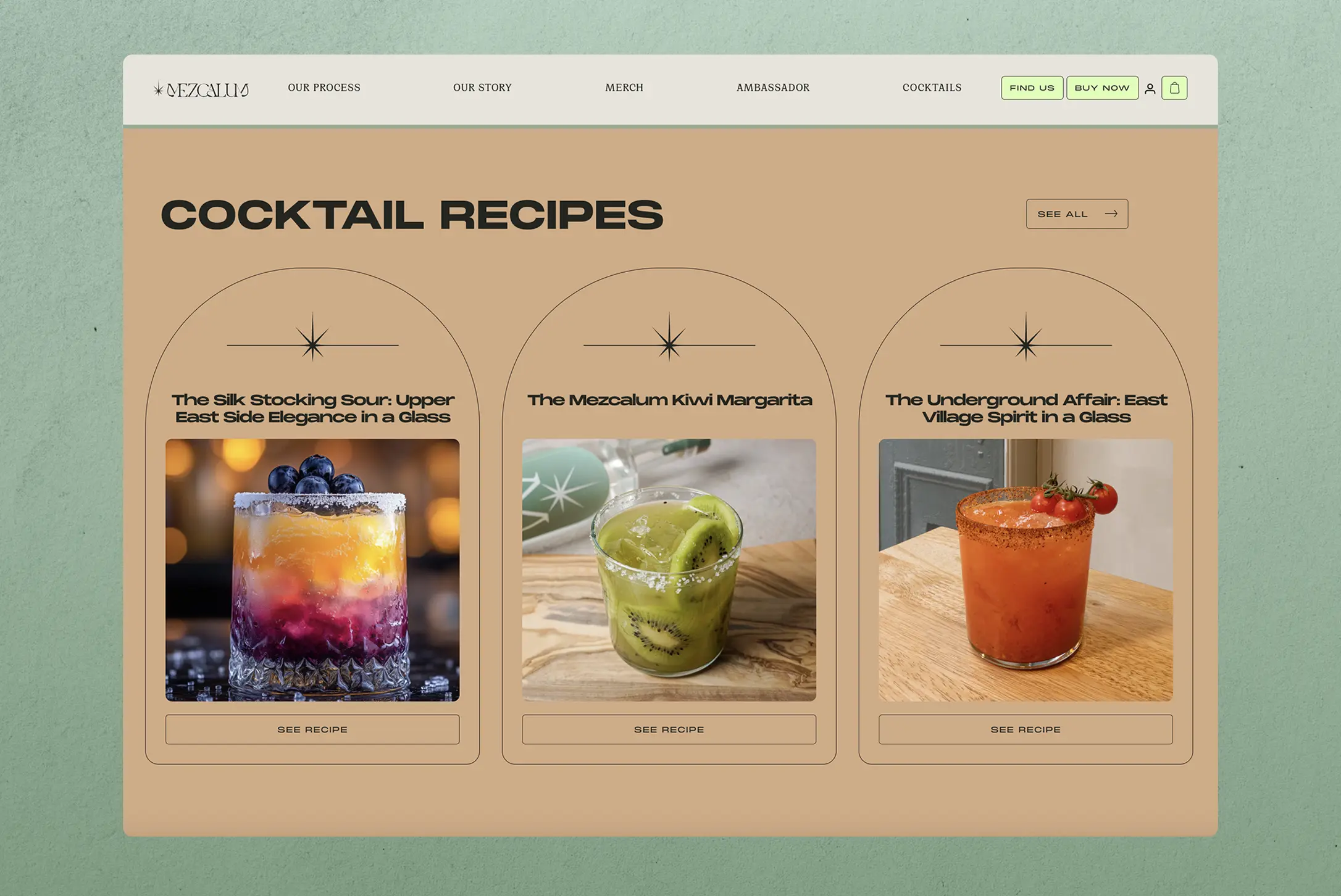
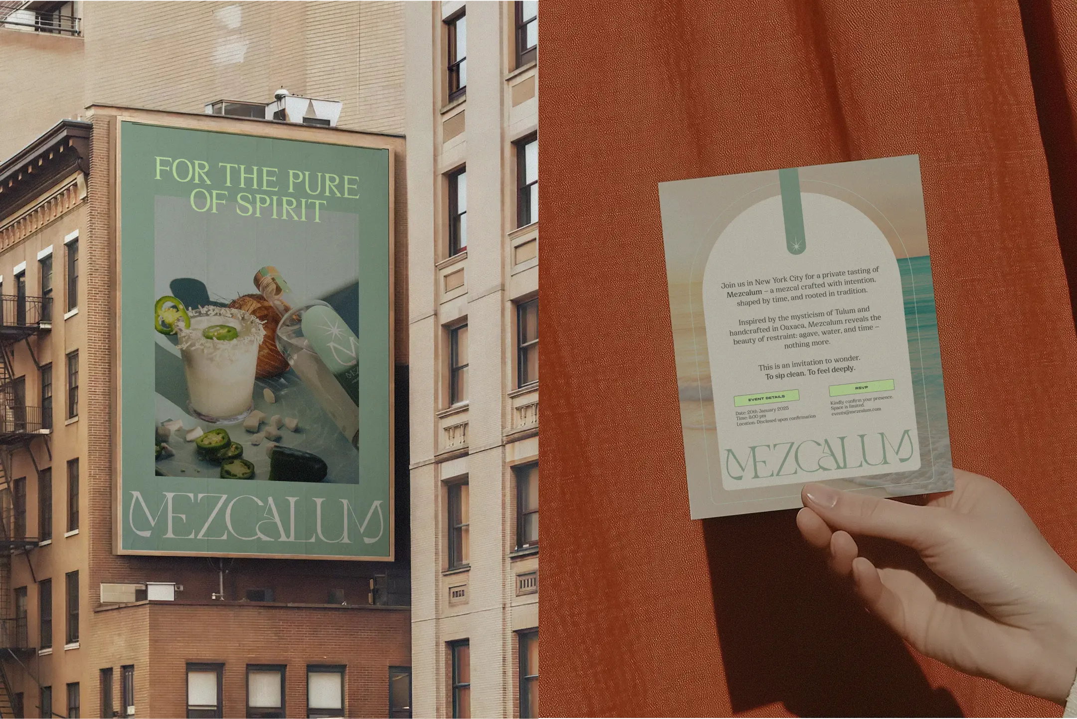
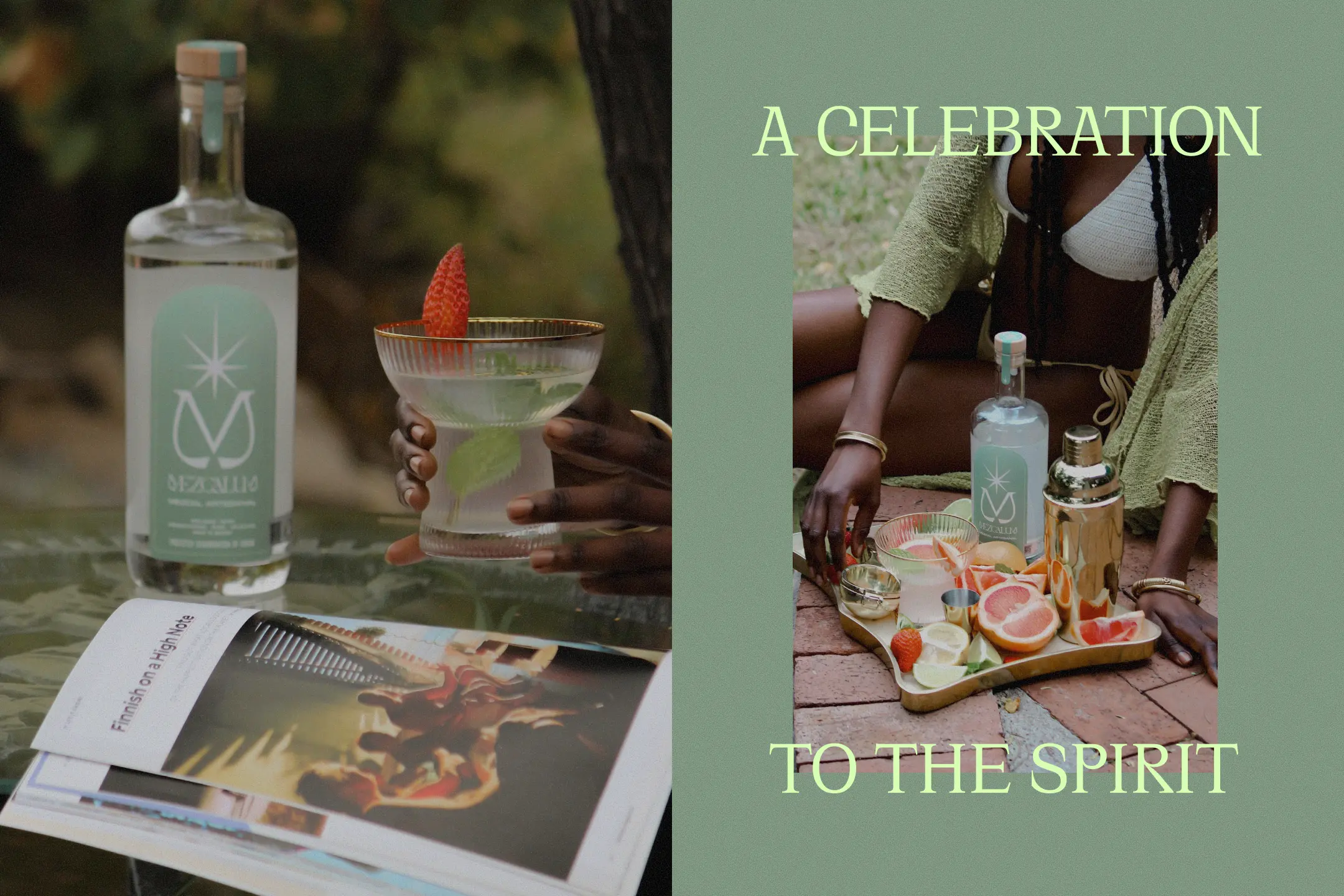
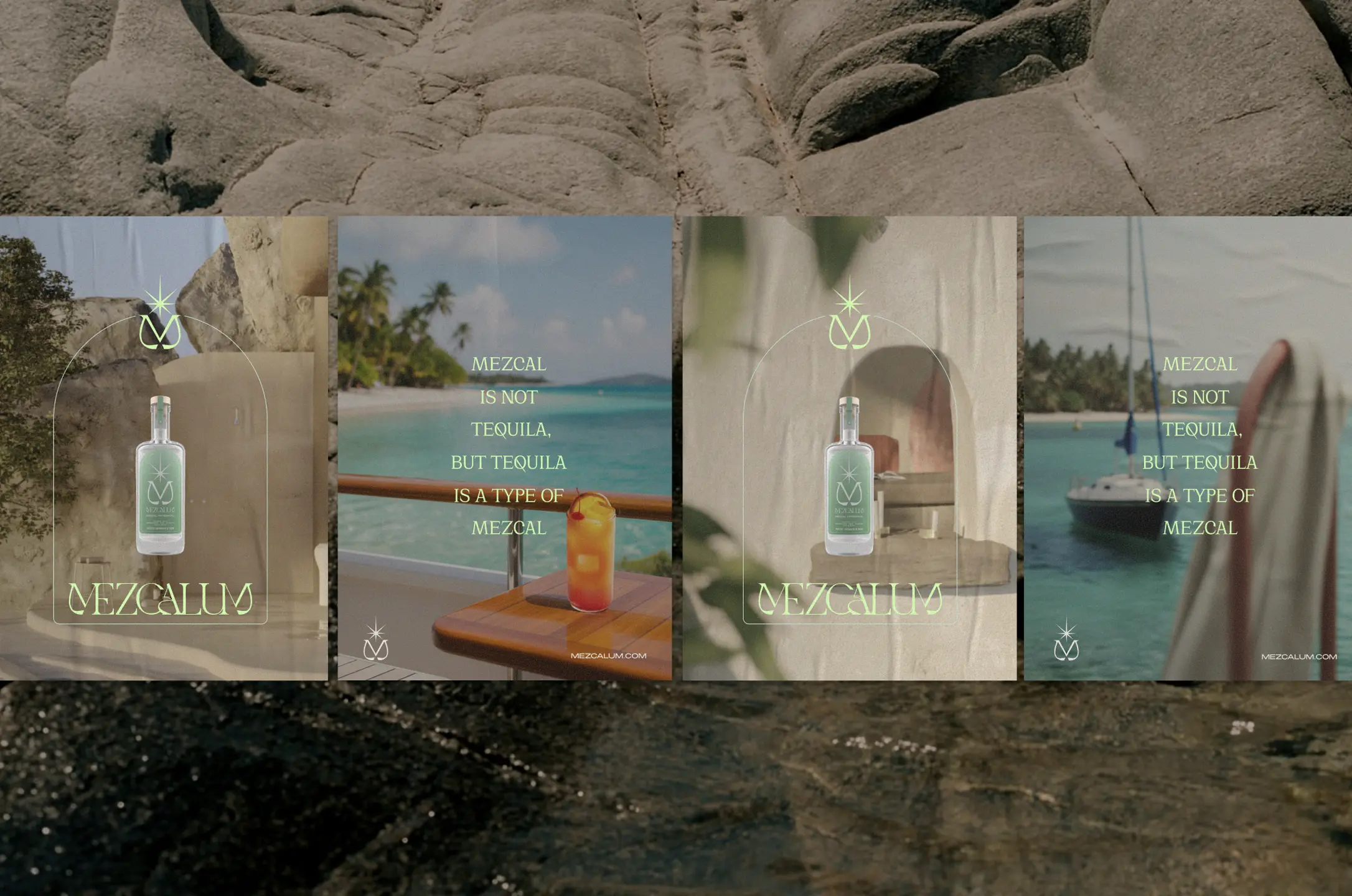
From the beginning, we saw an opportunity to challenge the visual conventions of the category. Instead of relying on the ornate, highly decorative aesthetics often associated with mezcal, we envisioned a brand that feels understated, contemporary, and effortlessly refined. One that speaks to a new generation drawn to a slower, more intentional way of drinking.
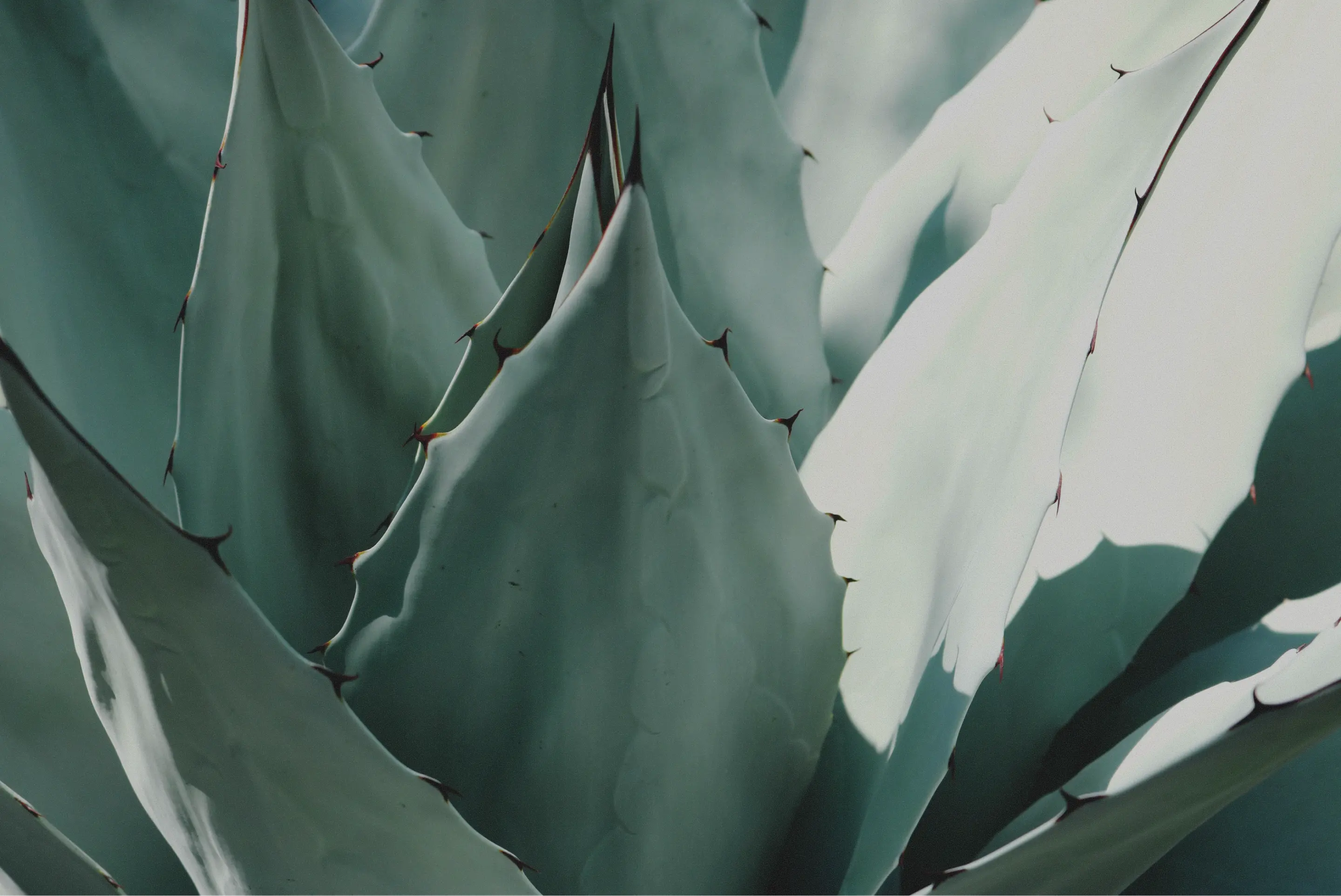
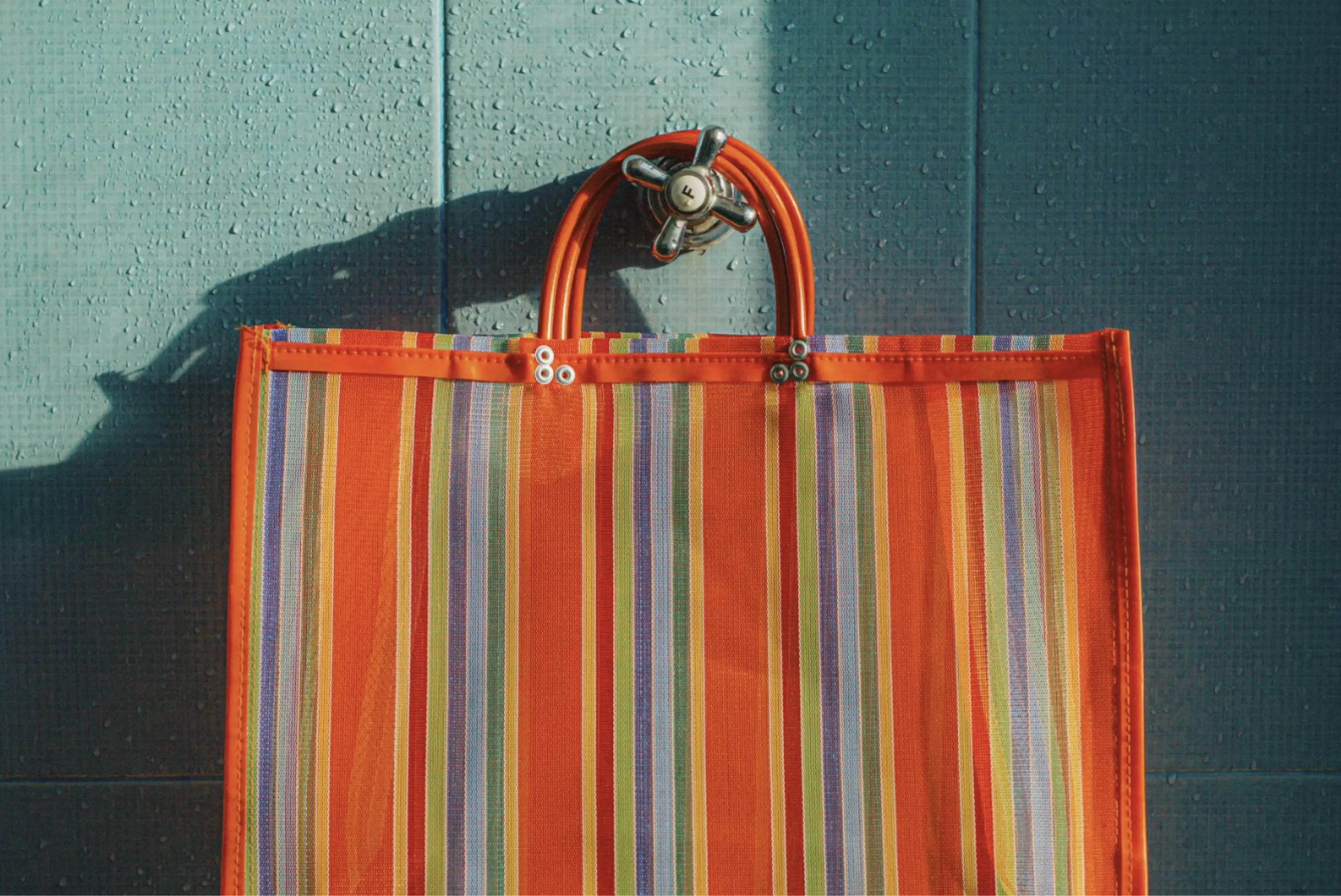
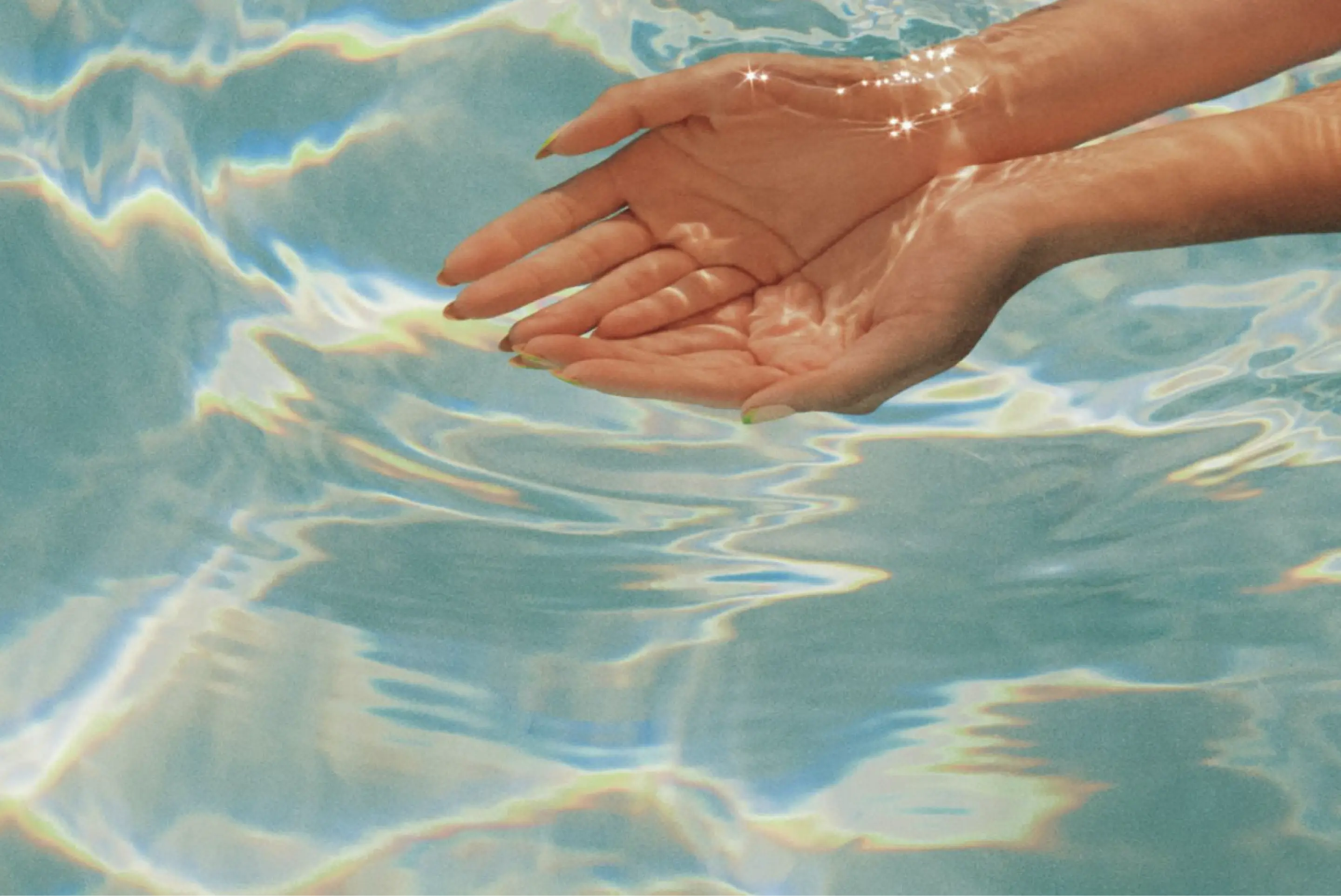
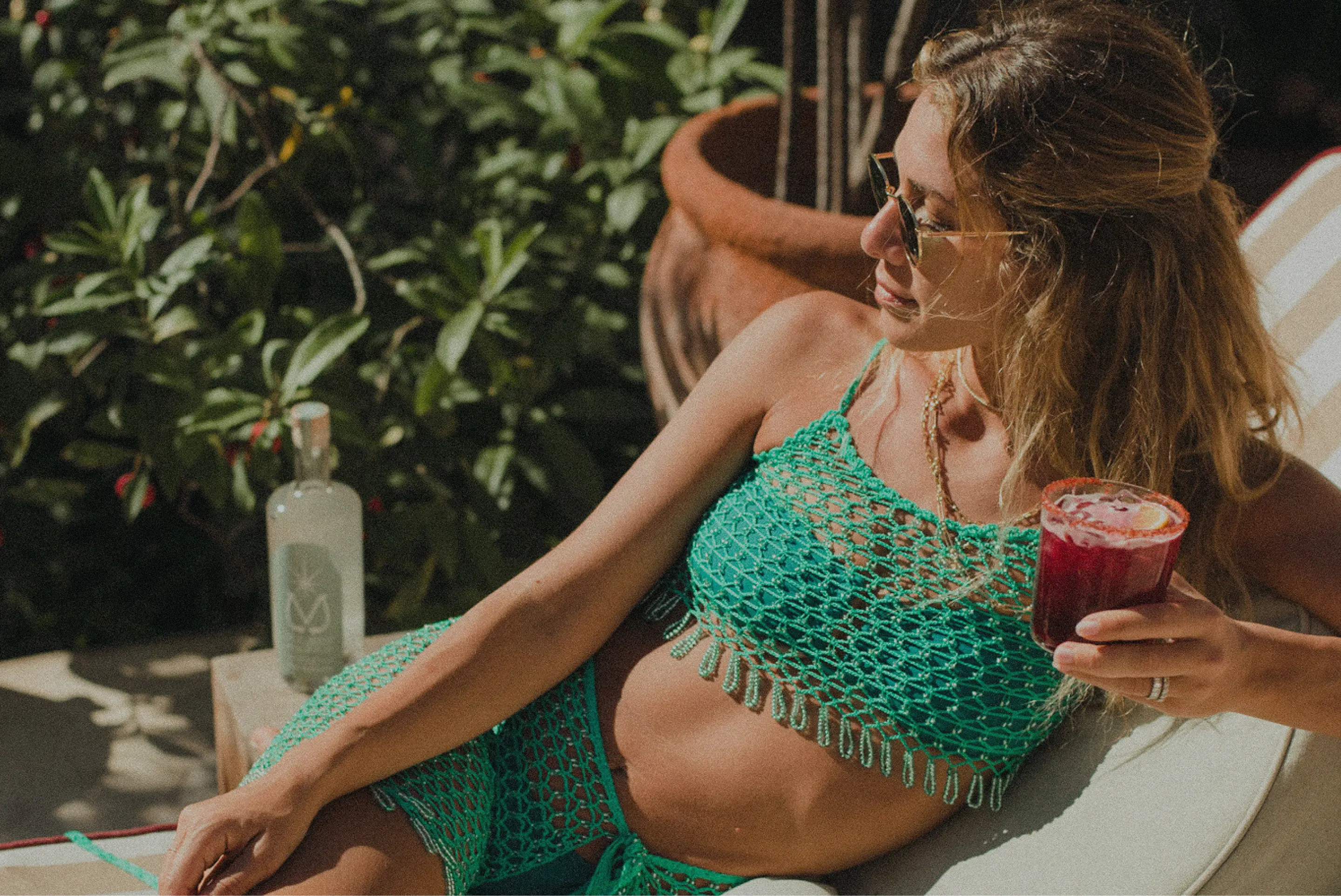
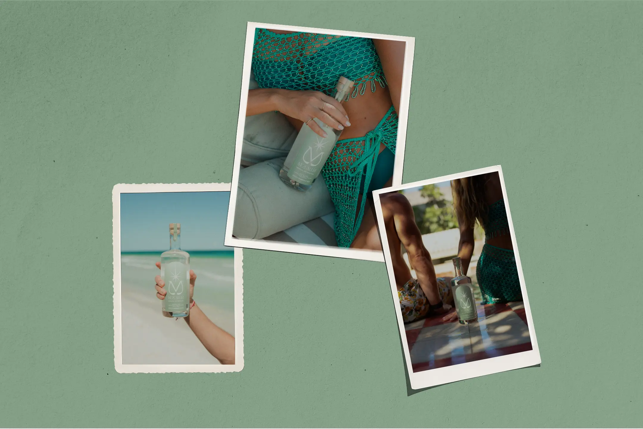
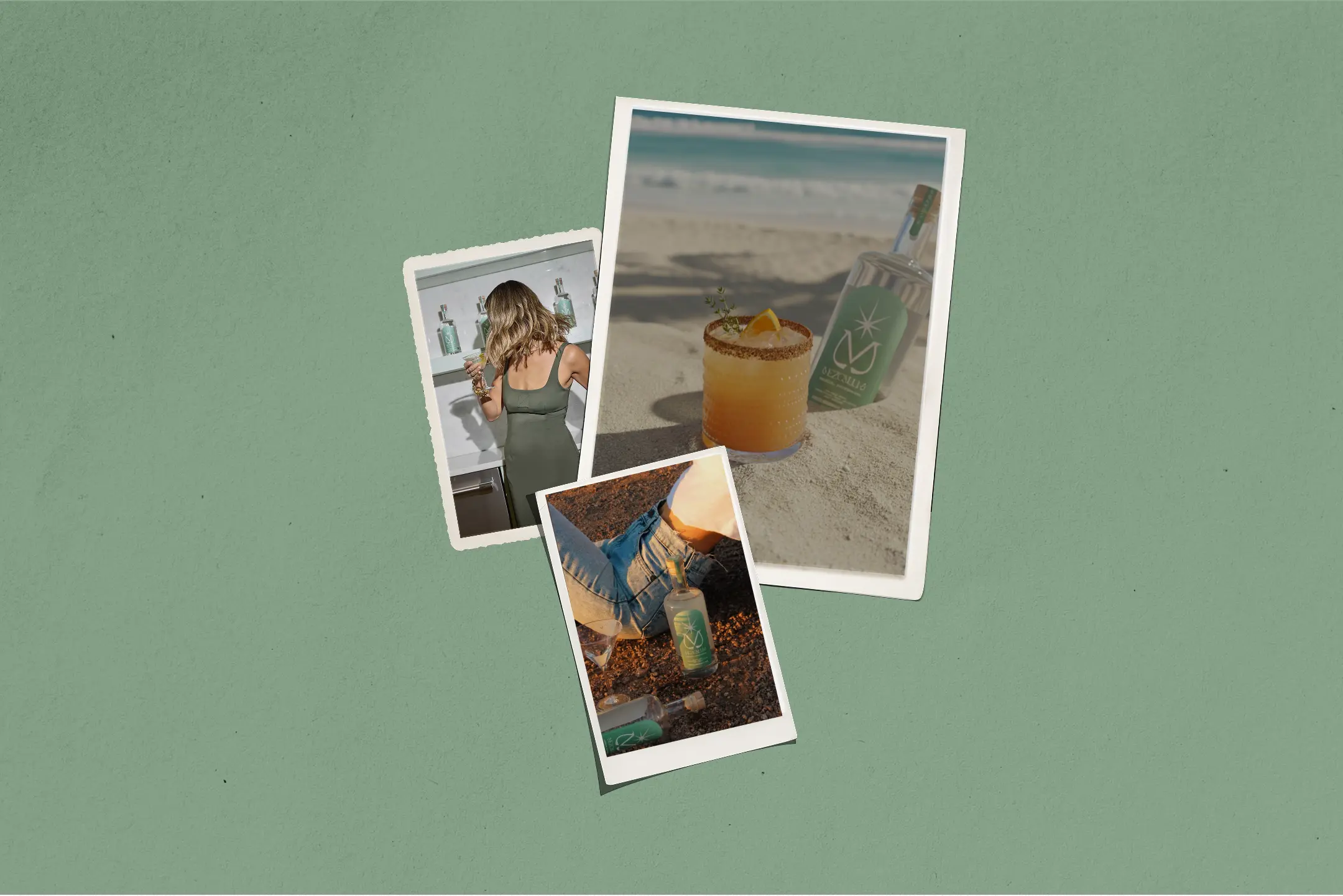
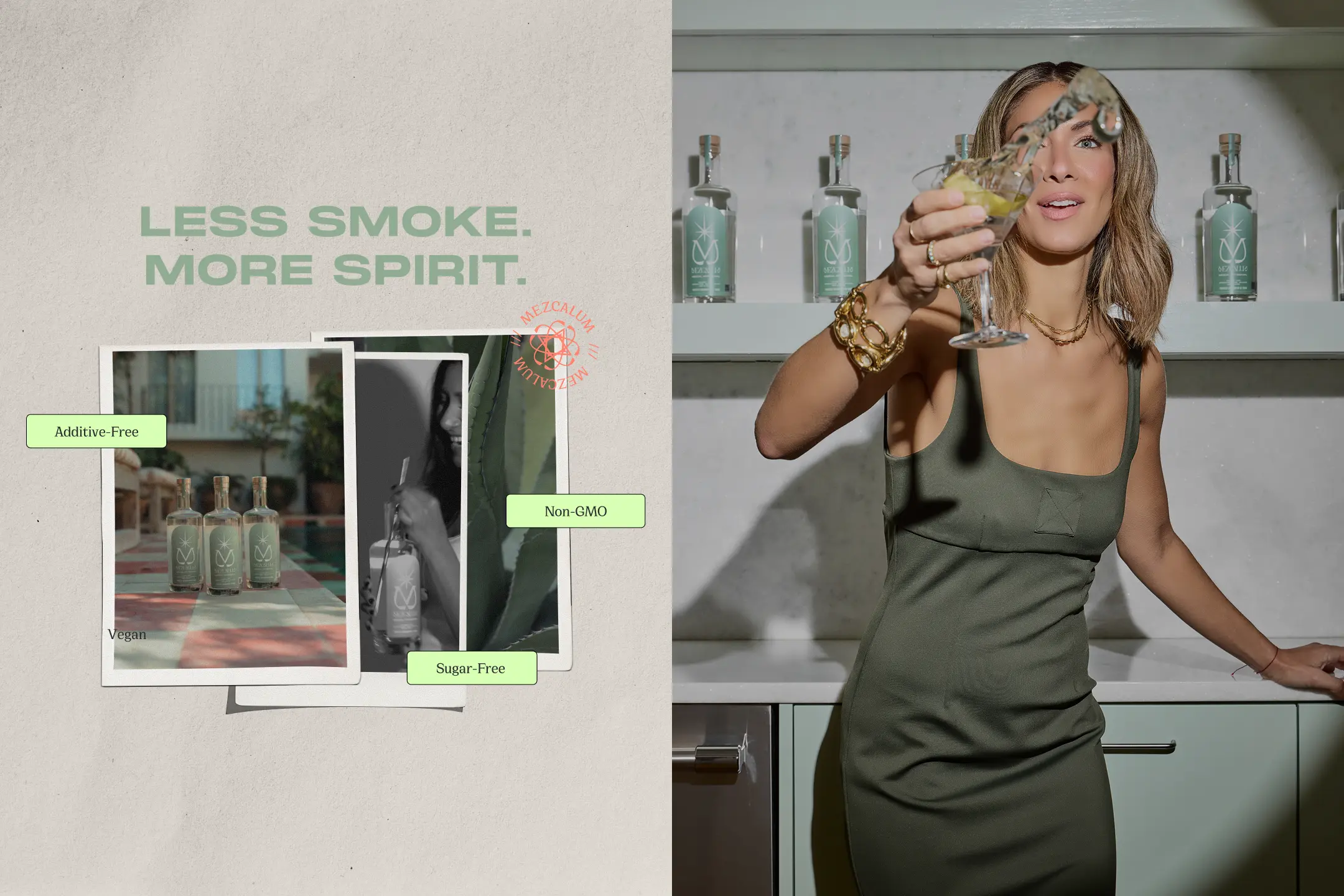
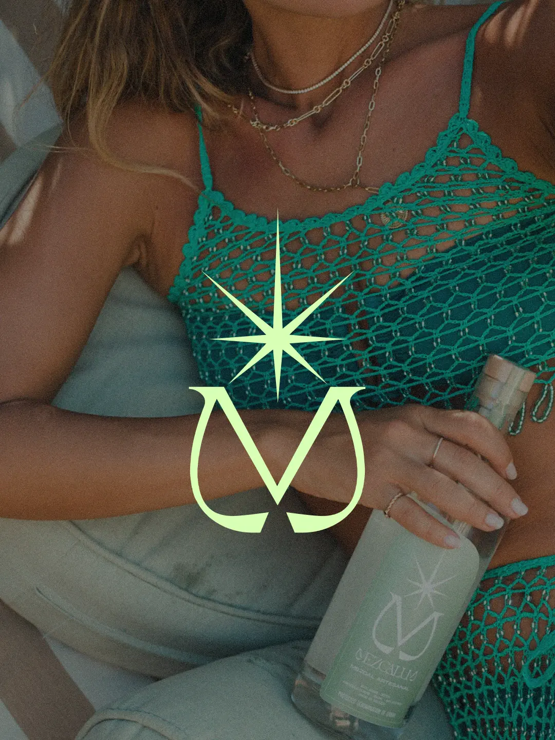
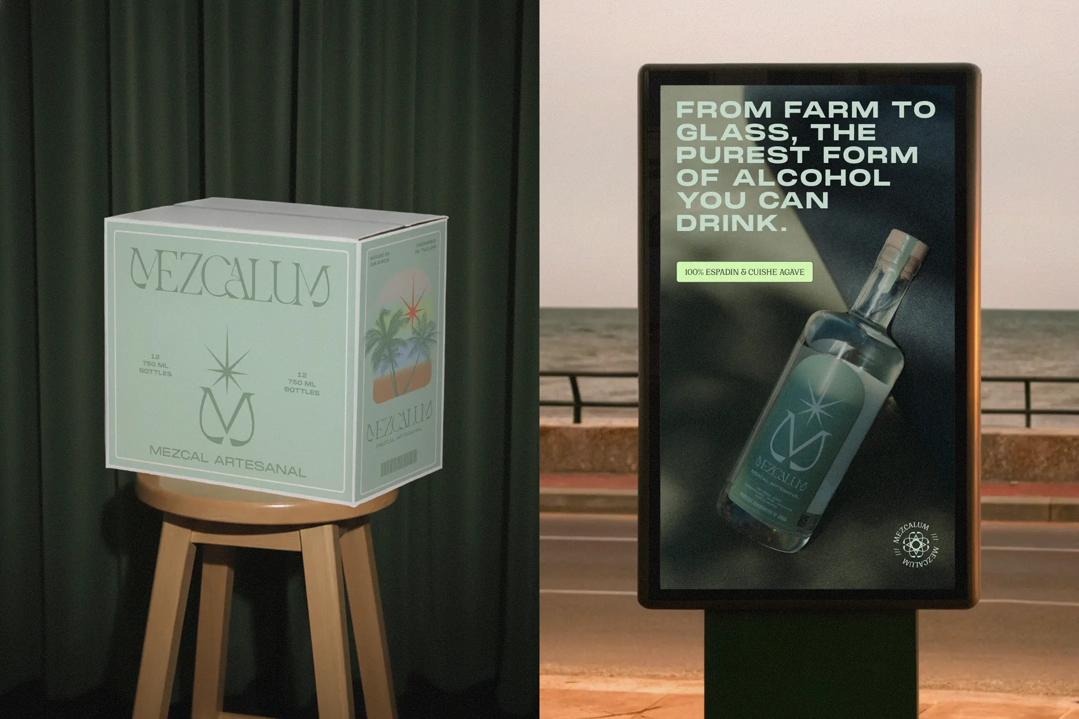
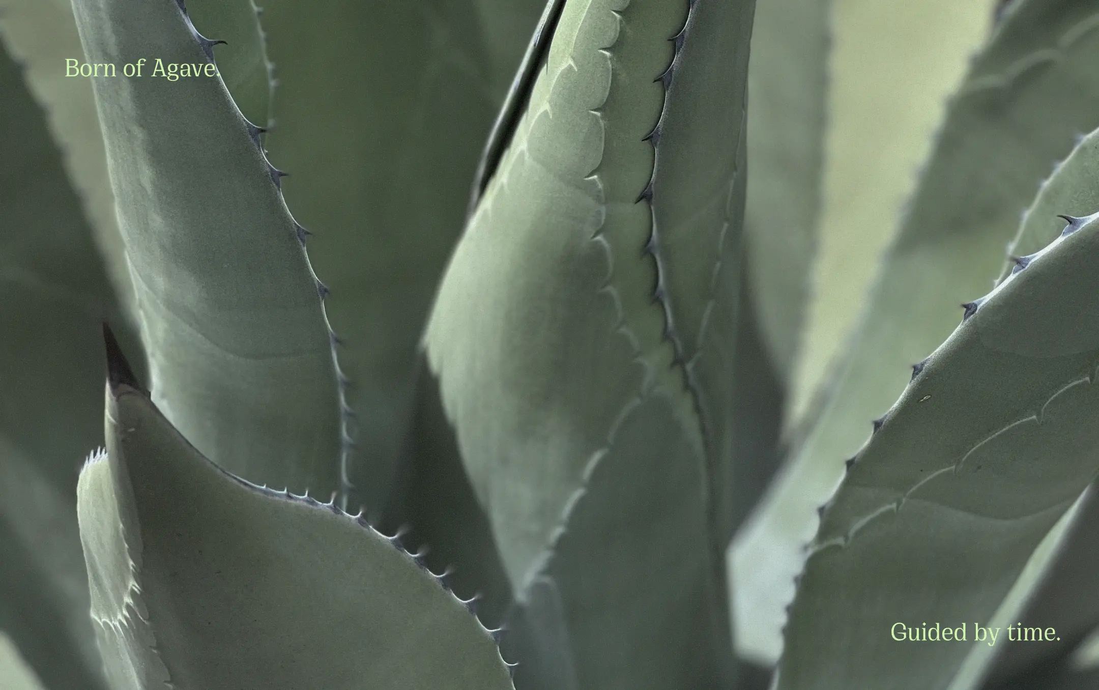
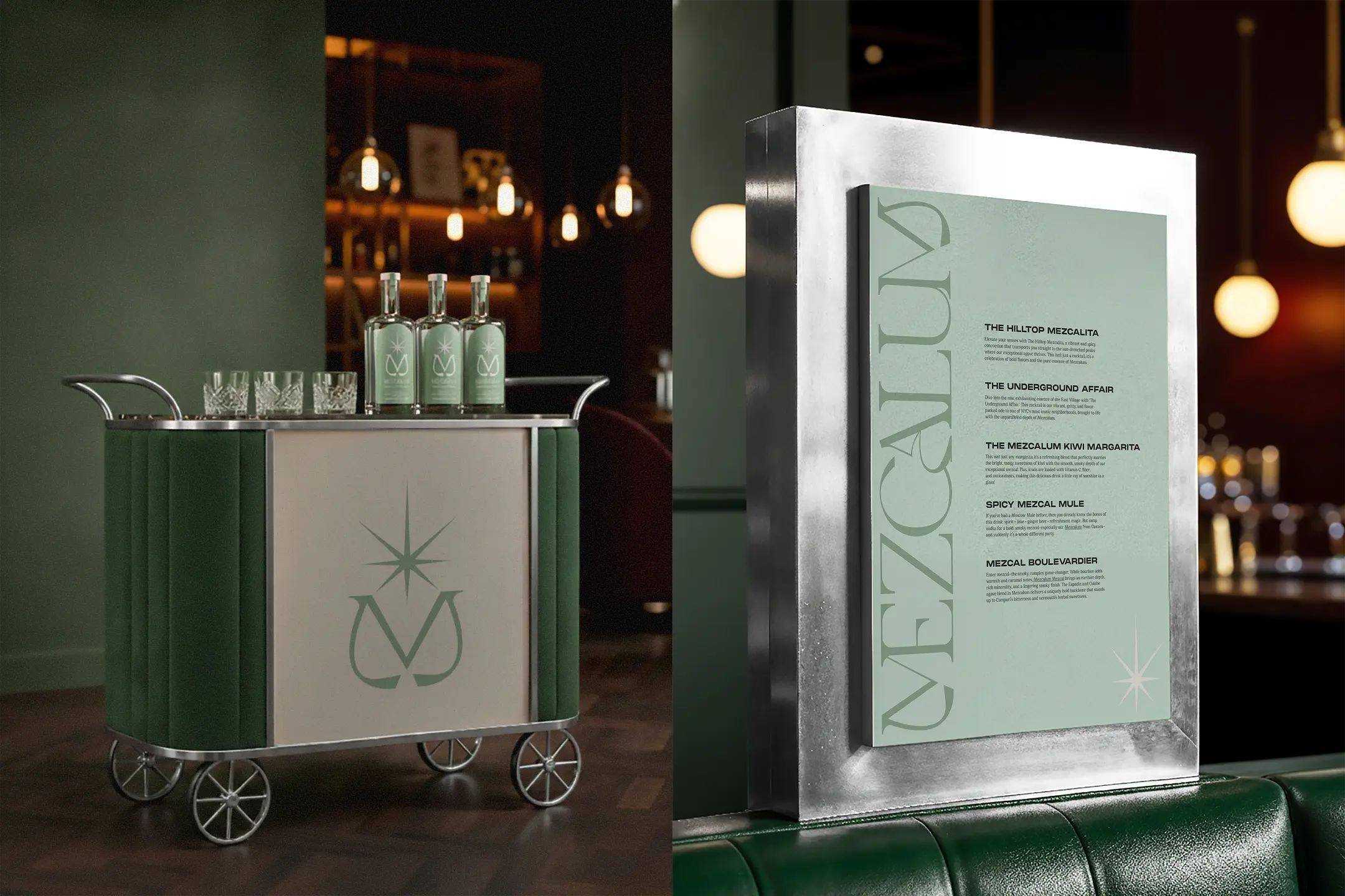
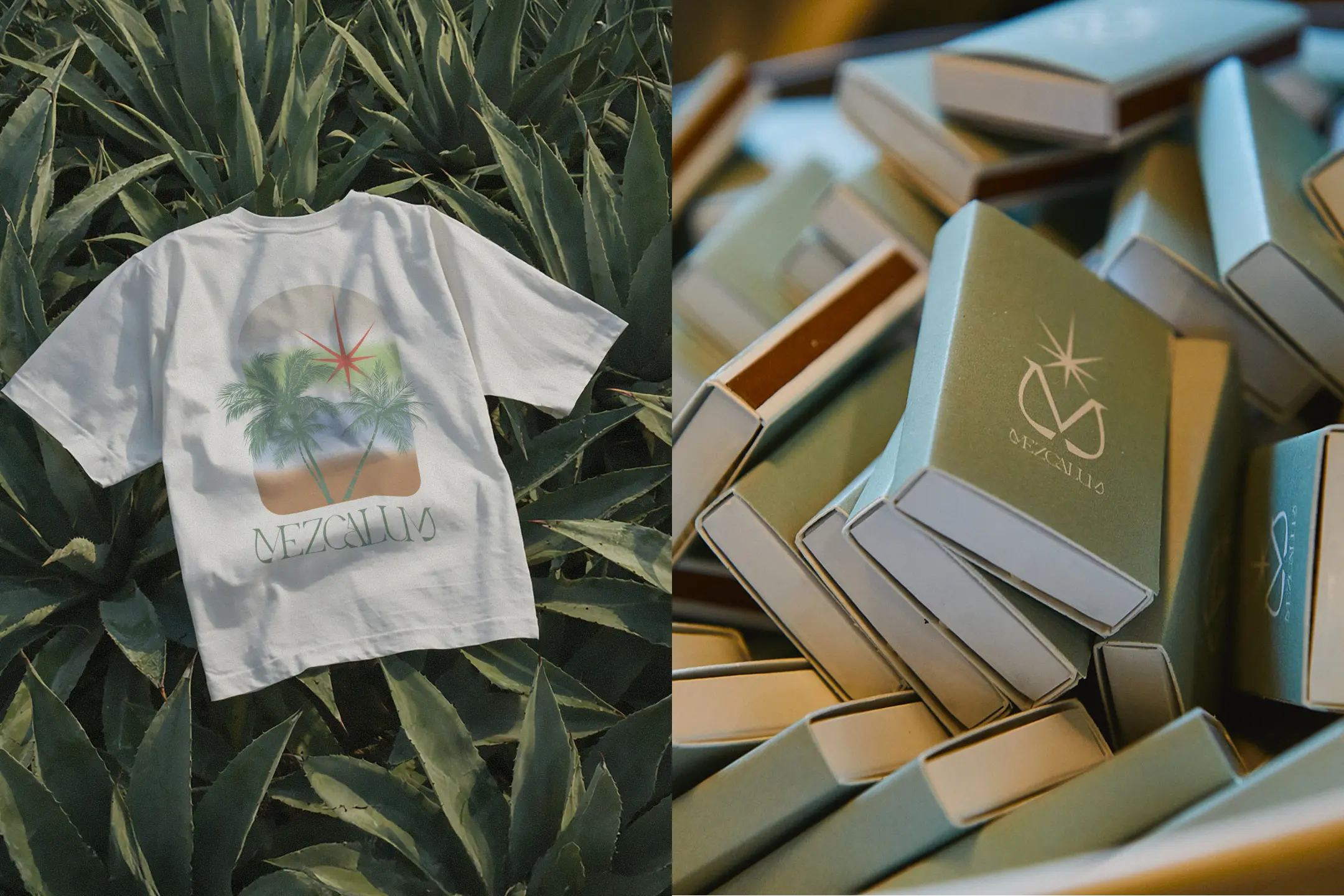
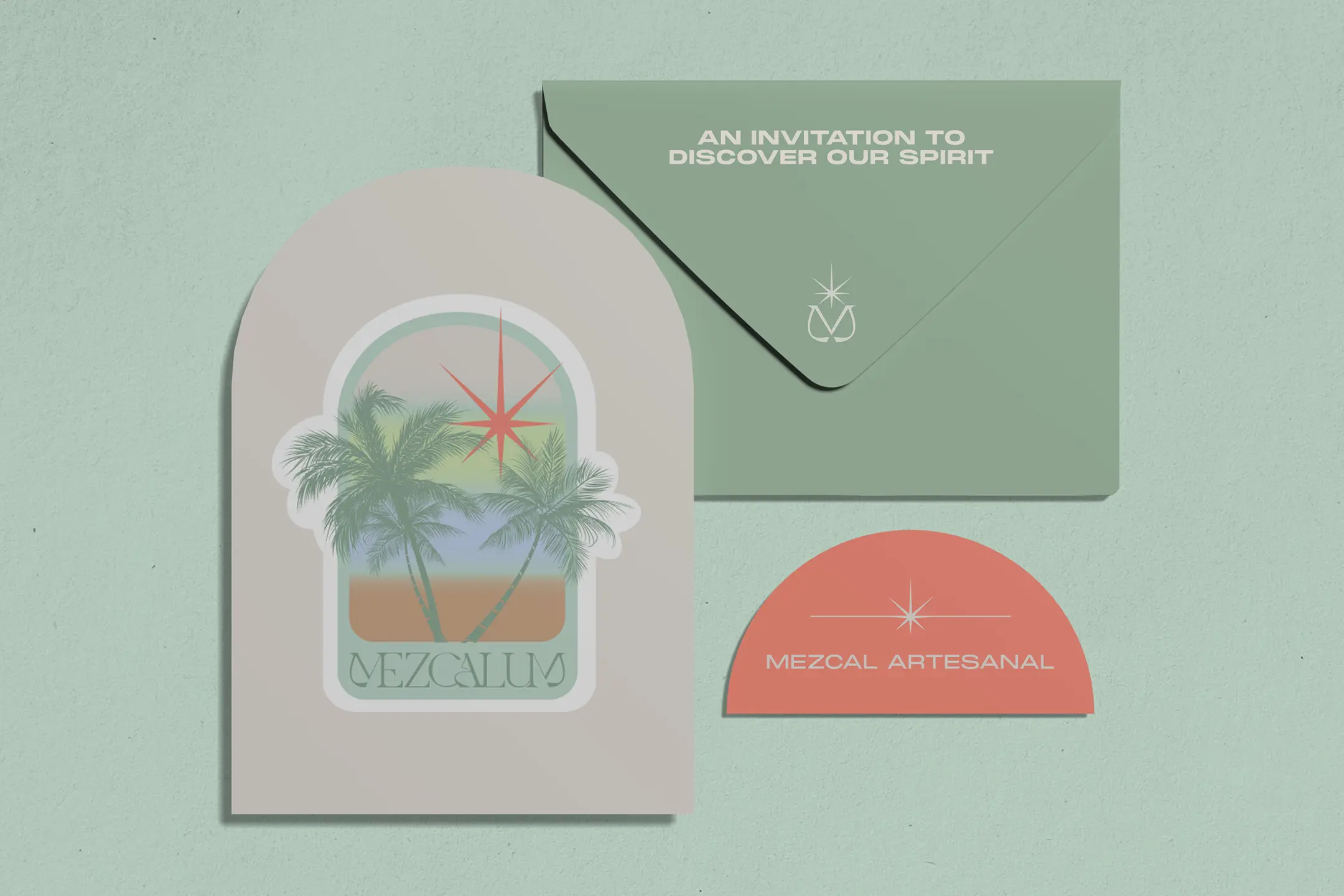
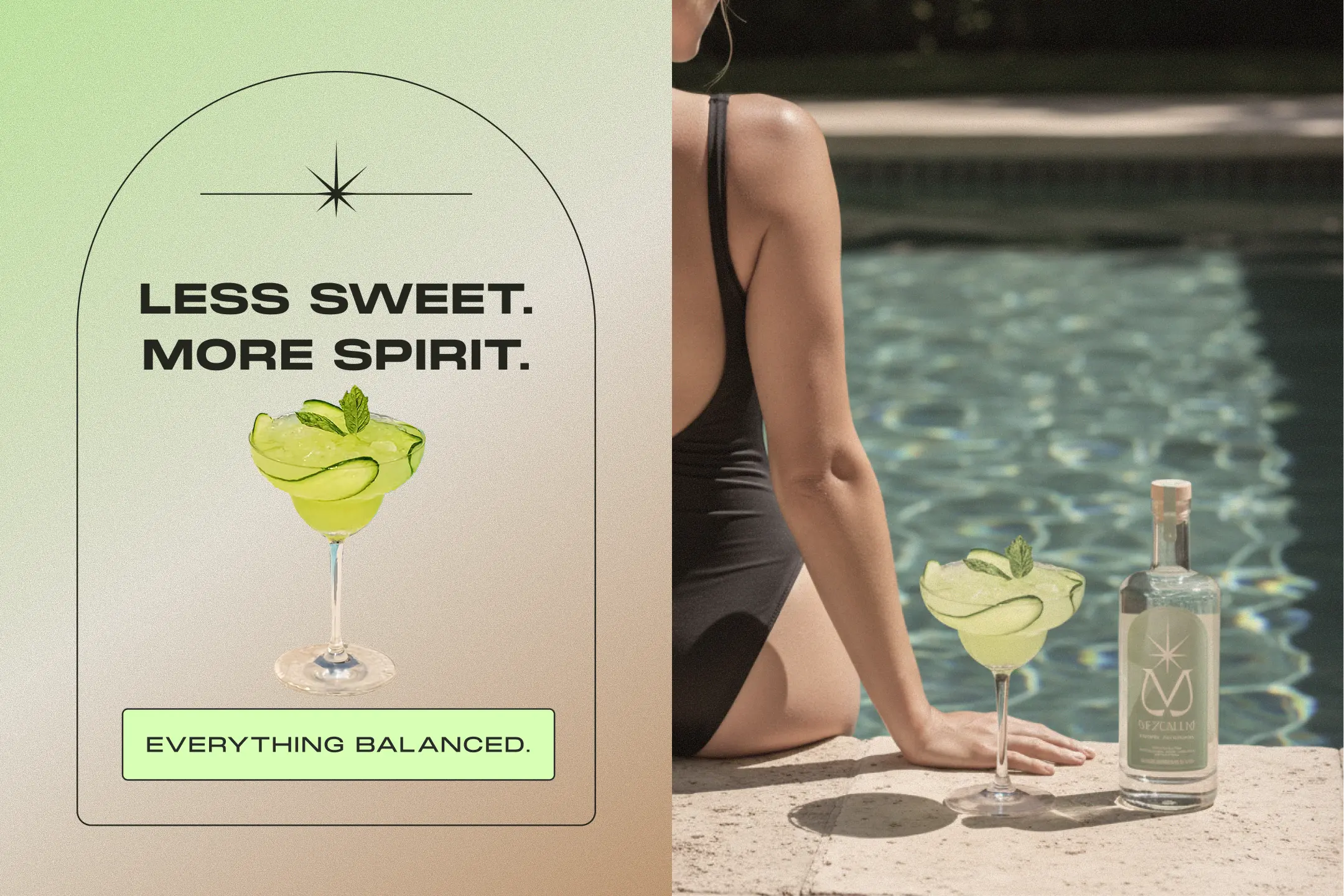
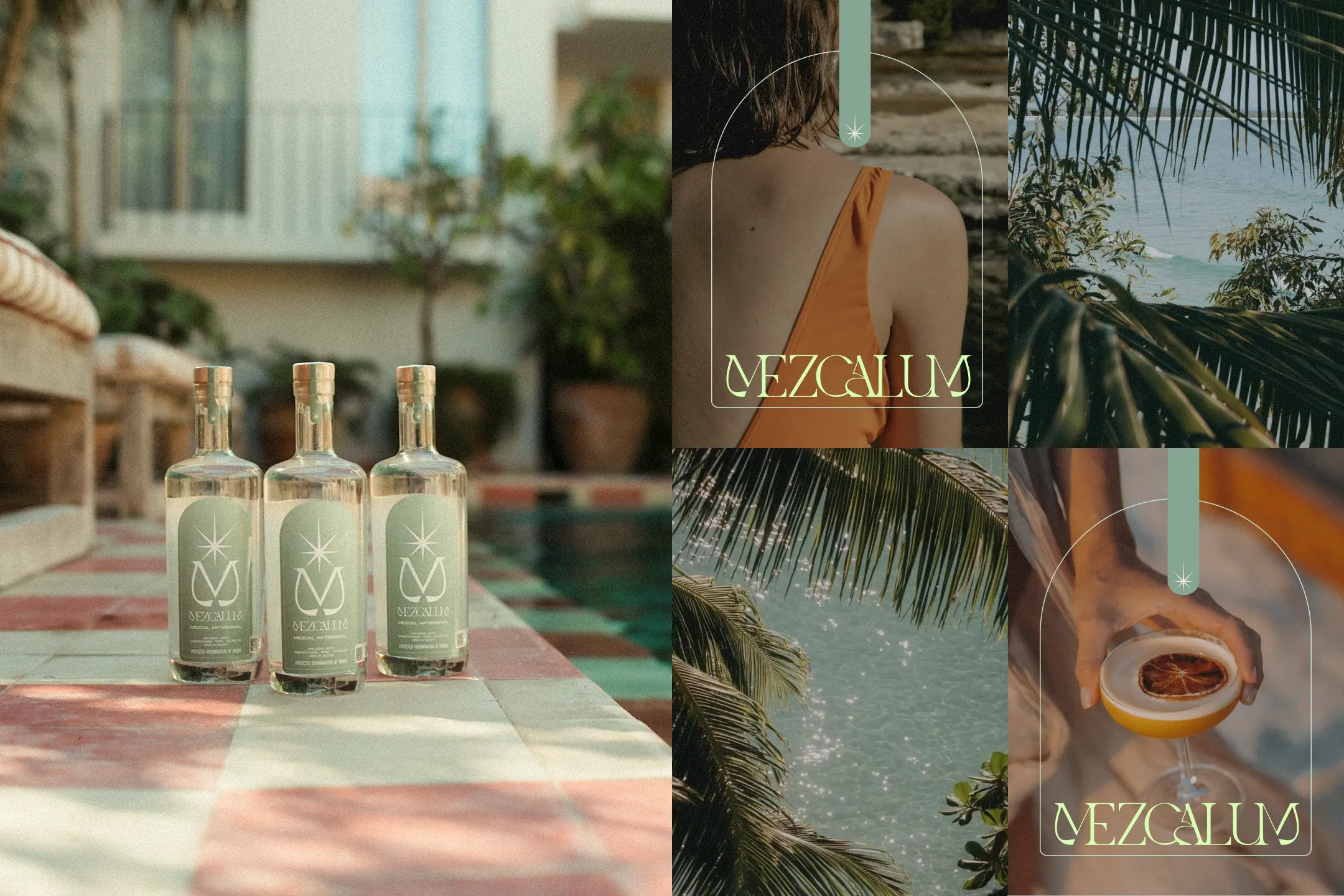
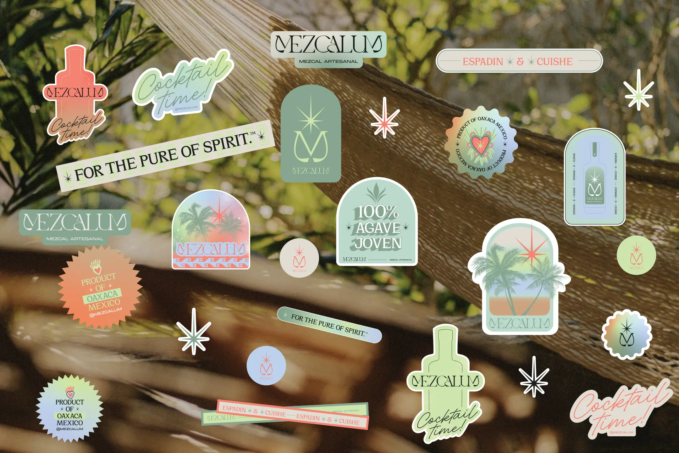
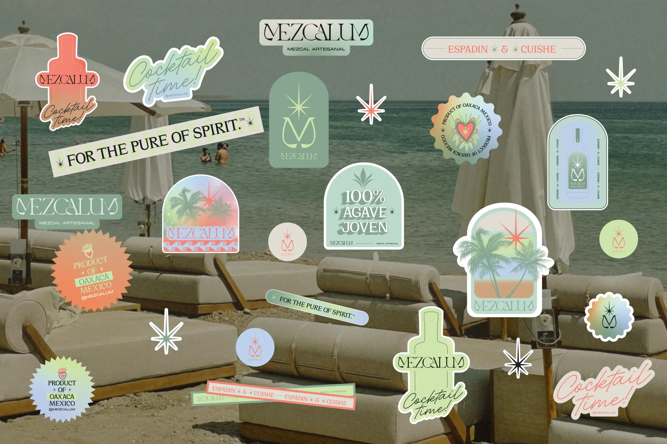
Every element of the identity was designed to reflect that mindset. The warm, sun-washed color palette takes its cues from Tulum’s natural landscape—soft sand, turquoise waters, lush greenery, and golden sunsets. The bottle itself embraces simplicity, allowing the craftsmanship of the spirit to take center stage.
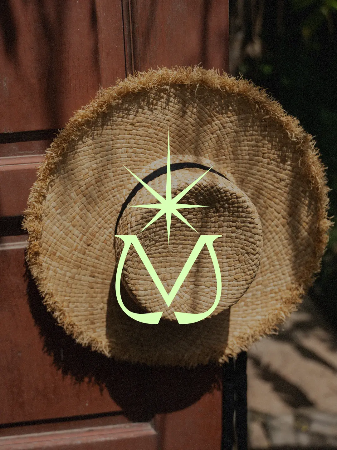
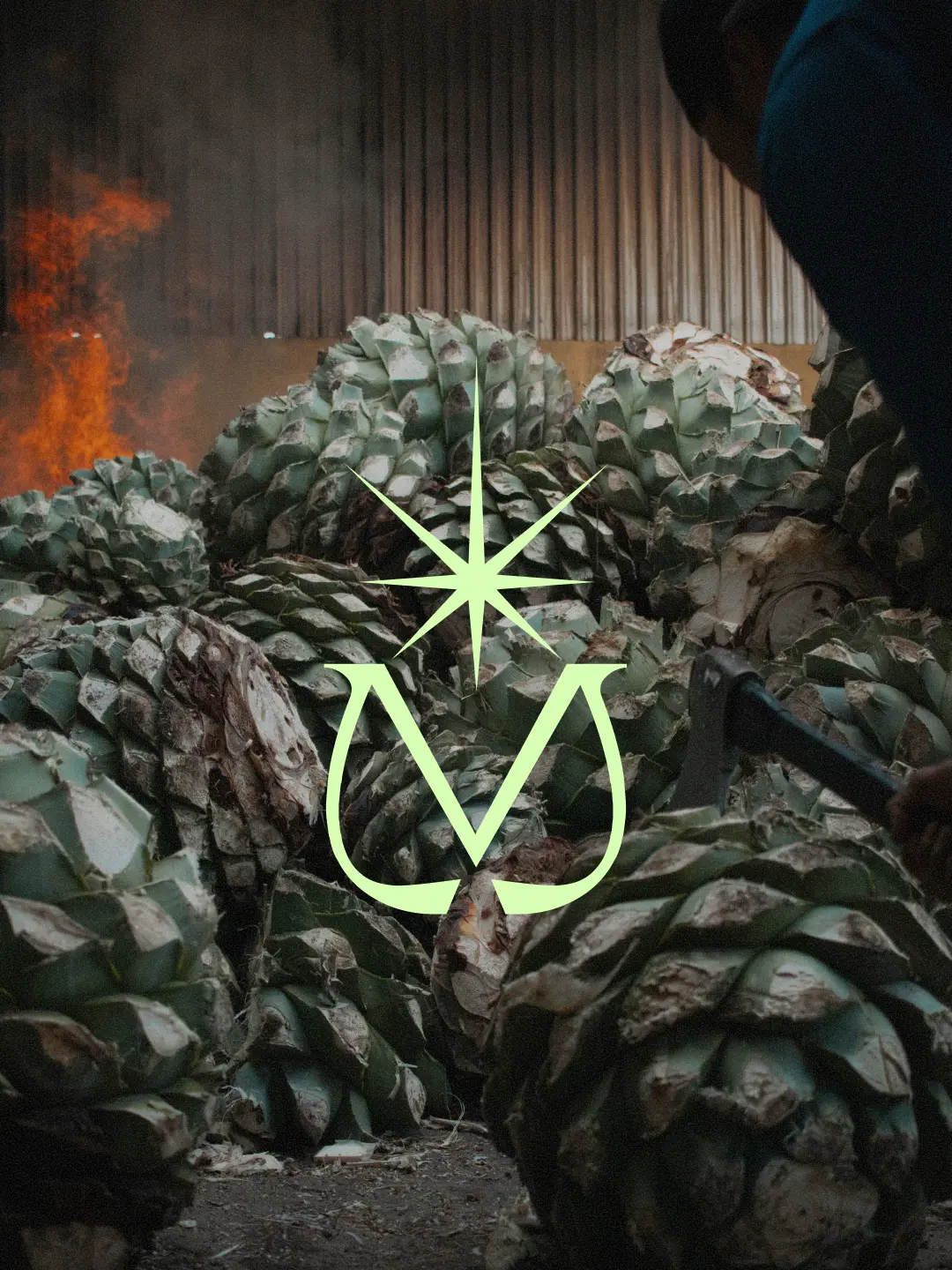
At the heart of the identity is a custom symbol that reimagines the letter
M as an agave plant emerging from the earth, crowned with a star. The mark evokes both the agave’s flowering bloom and the feeling of openness, wonder, and connection that defines Tulum.
The result is a brand that brings together two worlds: the centuries-old tradition of Oaxacan mezcal and the relaxed sophistication of modern coastal living. Honest in its origins, refined in its expression, and created for those who find true luxury in simplicity.